











The Plantation House
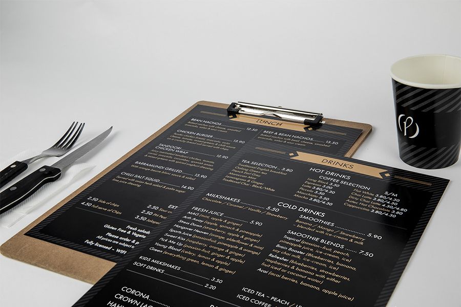
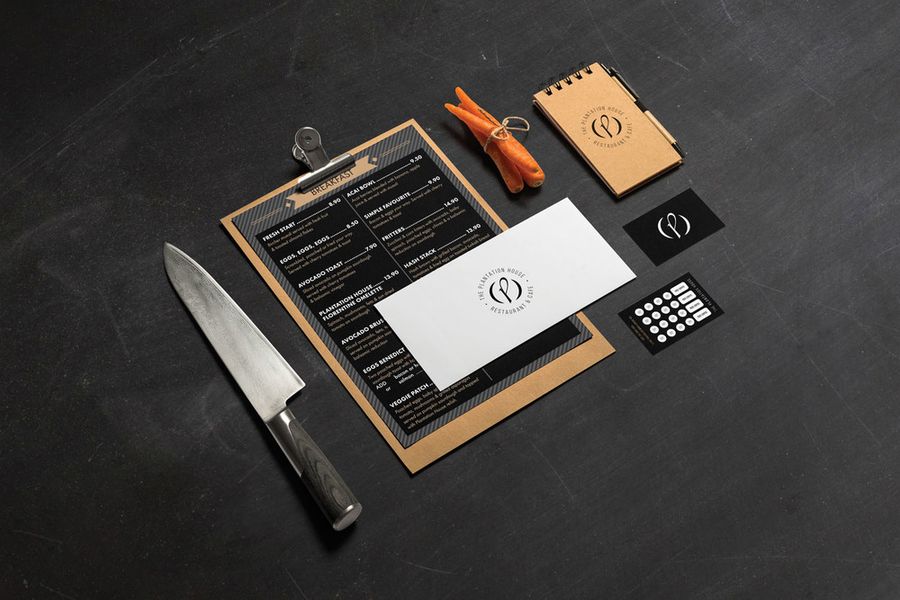
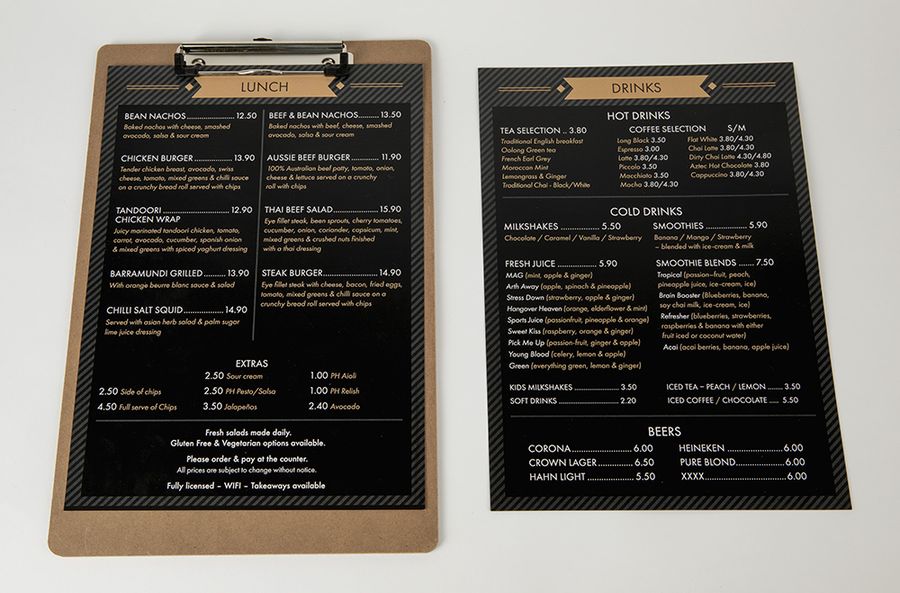
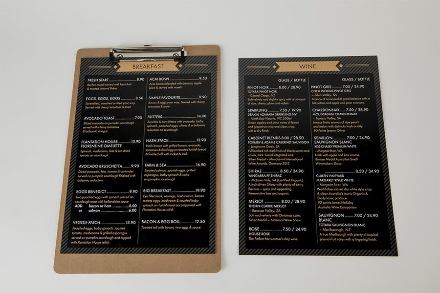
Brief: I was required to re-brand The Plantation House for Jackie Sheehy. The client was looking for a fresh new take on The Plantation House Cafe, with the main intent of bringing in more customers.
Tone: Fresh, elegant, modern, refreshing
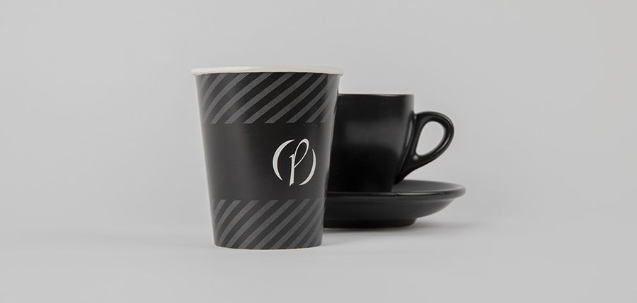
Idea: To design a brand that would fit into today’s growing modern environment, to appeal to more customers. The letter p in the logo was inspired by the shape of the coffee mug handle, a leaf and the word plant from The Plantation House. The round shape that surrounds the p represents the coffee stain from a coffee mug.
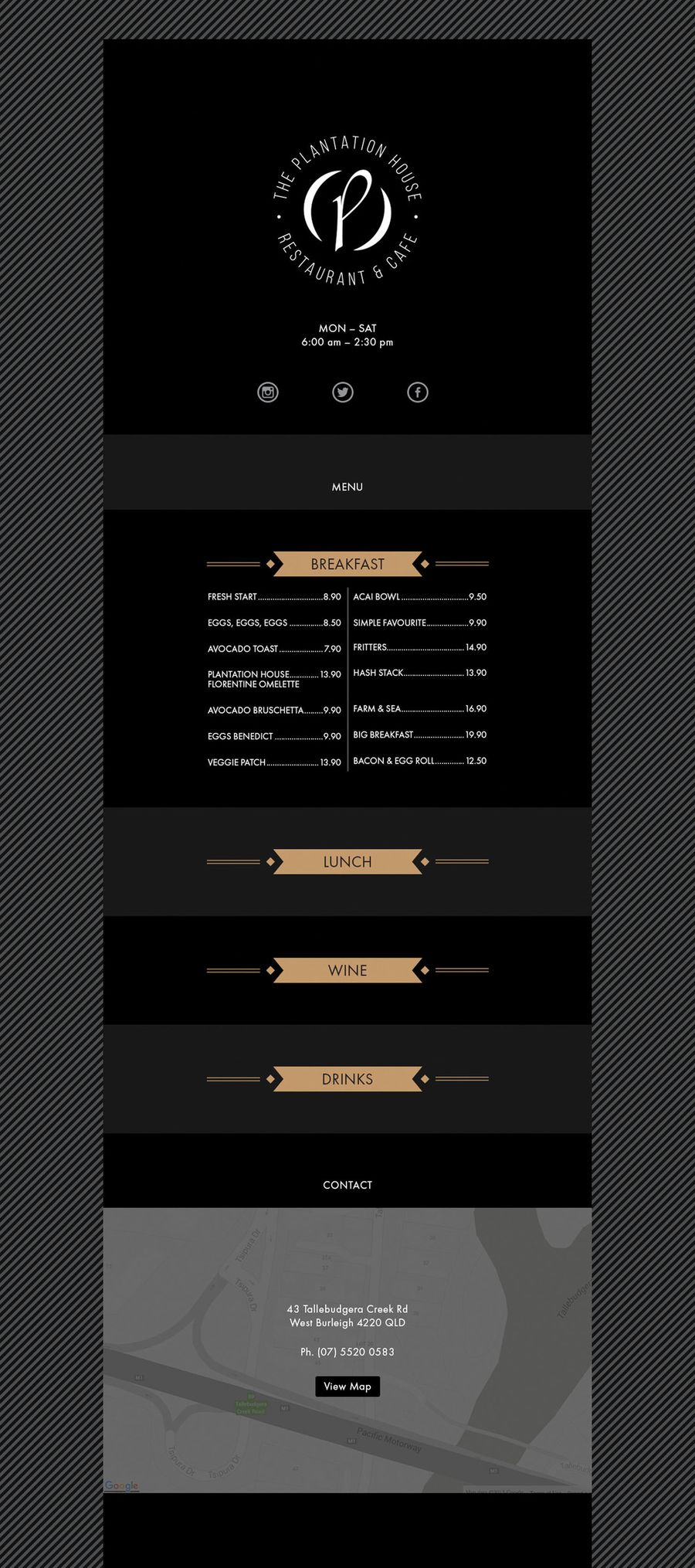
Website